Tips and Tricks
Hexa Center boasts a lot of quality-of-life features. This page will go into more detail about these features, providing insights on how to leverage them to optimize your user experience.
Explain where features are used, perhaps give examples per page where relevant.
1. Tips and Tricks definition
This page goes into detail about the quality of life features available to users of Hexa Center. By explaining these features in detail, our goal is to enhance the user experience, potentially saving you a significant amount of time.
2. Overview of Tips and Tricks in Hexa Center
An overview of all available Quality of Life features can be found below. We will start off by explaining general features you use on a daily basis. Further down the page, we will highlight more advanced tips and tricks that, while not used frequently, are valuable to know.
General tips and tricks
- Text filtering
- Date selector
- Time selector
- Rich text editor
- Automatic saving
- Refinement
Advanced tips and tricks
- Metadata
- Export
- Custom fields
3. General features: Text filtering
Text filtering aids in finding specific items from a lengthy list. This makes it extremely easy to find items based on even a small part of that items name.
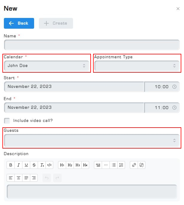
Every dropdown field in Hexa Center supports text filtering. Dropdown fields have a small up and down arrow icon next to them, to make them look slightly different compared to regular text fields. Clicking on the field shows all relevant selectable items. Typing in text will filter for items which include that text in their name.
Some examples of dropdown fields. The dropdown fields are highlighted in red. This example is taken from the appointment creation screen in the calendar addon:
4. General features: Date selector
The date selector is a feature used to simplify the proces of selecting a specific date using intuitive button layouts. Its opened by clicking on a date field. The date selector consists of 3 different screens:
- Day selector
- Month selector
- Year selector
The day selector: The initial screen when clicking on a date field. Enables you to click through individual months, allowing you to choose a specific date within the selected month.
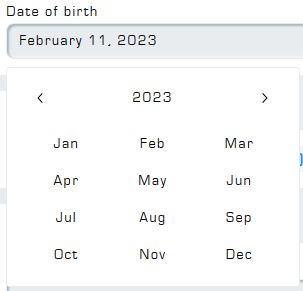
The Month selector In the day selector, click on the year and month to open the Month selector. In this screen you can select a year via the left and right arrow buttons, and a specific month from that year via the abbreviated month names. Selecting a month brings you back to the Day selector, where you can now choose a specific date from the selected month.
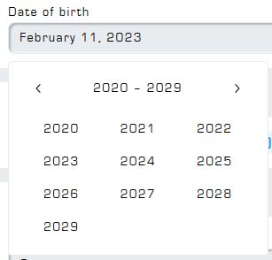
Year selector: Clicking on the year from the Month selector opens the Year Selector. Navigate through sets of years by using the left and right arrow buttons, similar to selecting a day in the Day selector. Selecting a year brings you to the month selector, after selecting a month you are presented with the Day selector again, basically allowing you to work back from years, to months, to individual days again.
5. General features: Time selector
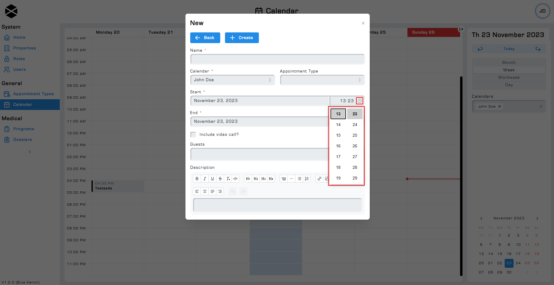
The time selector feature allows you to effortlessly select a specific time of day through an intuitive pop-up screen. The time field allows you to type in a specific time, as well as select a specific time via the time selector.
Clicking on the small clock icon next to the time field opens a dropdown-like menu where you can scroll through specific times. Both the hour and minute sections are individually scrollable. Chosen hours and minutes are automatically inserted into the time field.
Close the time selector by clicking anywhere on the current screen. Clicking outside the pop-up screen acts as if you are clicking the Back or X button. If there are unsaved changes, a pop-up will appear asking if you want to discard your changes.
6. General features: Rich text editor
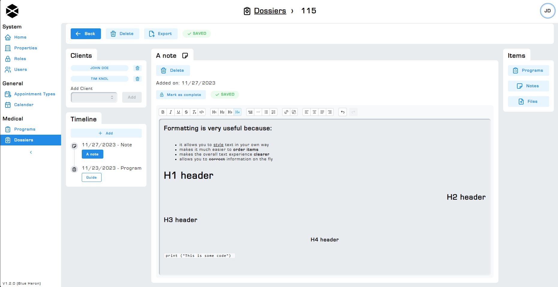
The rich text editor is a feature we are especially proud of. Using the rich text editor you can use markup to customize and style text according to their preferences. This capability empowers users to apply a wide range of formatting options to achieve the desired look and feel for their text content.
A list of supported markup elements can be found below:
-
Bold text
-
Italic text
-
Underline
-
Strikethrough text
-
Code
-
H1, H2, H3 and H4 headers
-
Blockqoutes
-
Horizontal lines
-
Bullet list
-
Ordered list
-
Aligning text left, center, justify, right
Clear formatting by using the Clear formatting button on the rich text editor. The rich text editor also allows you to undo or redo your edits. Undo an edit by clicking on the left arrow button, redo an edit by clicking on the right arrow button.
Hovering over a button shows a tooltip explaining the button's functionality.
7. General features: Automatic saving
Automatic saving is a feature that allows certain forms to automatically save as soon as no further changes are made.
Not all forms support this feature. In forms where this feature is enabled the save button is replaced by the Save status icon. This icon indicates the current saving status of the form being edited.
When making changes to the form the Save status icon briefly changes from Saved to Saving. The saving process usually only takes a second, though it might take longer depending on the changes made and the size of the item being edited.
.
8. General features: Notification system
The notification system refers to the way you are informed by Hexa Center about the results of actions like creating, deleting and updating items. When creating, deleting or updating an item the system will notify you about the items status via a notification. Motifications always appear at the top right of your screen.
The status of an update action is not always shown via a notification because of the the Automatic saving feature. On forms where the automatic saving feature is enabled, no notifications for updating an item will be generated. Creating or deleting items will still show a notifcation. Read more about the automatic saving feature in section 7.


9. General features: Refinement
Use refinement to fine tune your results through the use of (advanced) conditions. Filter dossiers by a single client or group of clients on the Dossiers page. Filter through users based on age, gender, role, or any value in the column headers.
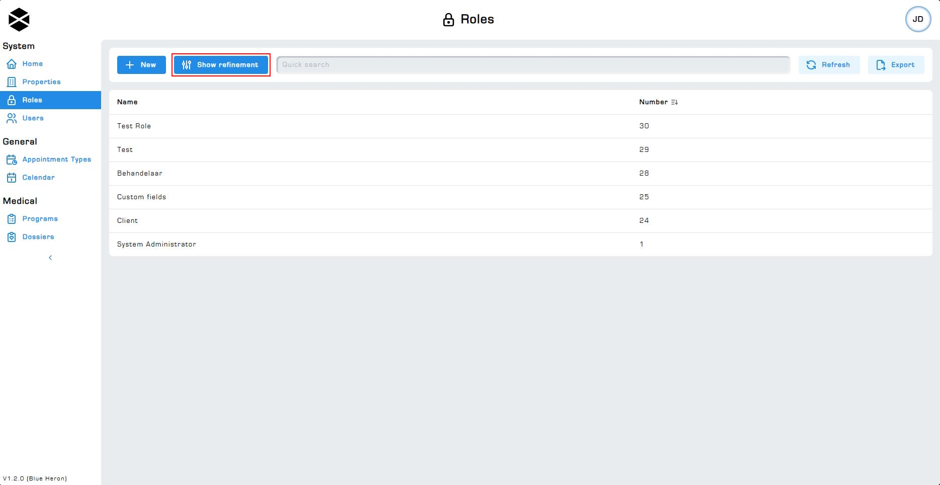
Click on the Show refinement button to open the refinement window. This window will open on the right side of your screen, allowing you to still see the entire item overview.
Values for creating conditions vary per page. Experiment with the available options to discover what is possible via the refinement feature.
9.1 Filter text fields
Filtering through text based fields is very similar to using the dropdown text filtering, as explained in section 3, Text filtering. Instead of showing options through a dropdown, it displays the filtered results directly in the table.
Filter through dates via the: equals, later than, earlier than and between options.
- Equals: Filters items where the date in the field is from the specified date.
- Later than Filters items where the date in the field is beyond the entered date.
- Earlier Than: Filters items where the date in the field is not yet past the entered date.
- Between: Filters items where the date in the field falls within the range of the two inputted dates.
9.2 Filter dropdown fields
Dropdown fields are used when values are clearly limited and defined, such as when filtering for a role on the Users page. All roles can be selected through the dropdown. Filter through the pre defined values of a dropdown field using the Text filtering feature. Please (re)visit section 3 to read more about the text filtering feature.
The filtering through the use of a dropdown field works exactly the same way as when filtering for users or clients on the calendar page, program page and other pages. Add one or multiple items to the dropdown field, filter for text by using the text filtering feature, and select the options you want to filter for using the dropdown menu.
For example lets say you want to find all dossiers belong to 3 different clients. You can very easily filter for multiple clients via the dossiers page by adding the clients to the dropdown field.

9.3 Quick search
Use the quick search function to quickly search for part of an item's name. For example you can easily find all users named: "John" by simply entering "John" in the quick search field.
Alternatively, enter "doctor" to quickly display all roles with "doctor" in the name.

9.4 Ordering results
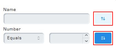
Order filtered results through the use of the sort buttons next to the fields. Sort by ascending values or descending values, as represented by the icons. When not selecting either of these options the system will sort by ascending, putting smaller values first.
10. Advanced features: Metadata
An item's Metadata stores all kind of useful information like: the number (ID), creation date, created by, updated at, updated by. Below is an explanation of these fields:
- Number (ID): Shows the number assigned to the item. Numbers start at 1 and count up for each created item of that type.
- Creation date: Shows the creation date of the selected item.
- Created by: Shows what user the item was created by.
- Updated at: Shows the last date the item was updated on.
- Updated by: Shows what user the item was last updated by.
The system continues to display the user's name in the metadata fields even after deactivation. The Created By and Updated By fields serve as documentation, reflecting the user responsible for creating and modifying items.
11. Advanced features: Export
All overview pages feature an Export button. The export feature allows you to quickly convert all on screen items to an Excel-based dataset. The export feature works together with the Refinement feature, read more about the refinement feature in section 9., to allow for the creation of customizable datasets in .XLXS format.
The export feature only exports items which are currently rendered on the page, this makes it work together with the refinement feature to allow you to only export items based on your refinement criteria. For an export of all items, scroll down to load all items first.
Exports are generated in .XLXS format, this is the standard Microsoft Excel format for spreadsheets. If Excel is not installed on your computer, for example when working on a Mac, you might recieve a message asking you with what app you would like to open the file. If this is the case, and your organization owns Office365 licenses, you can open the file via the browser. Read more about opening Excel files via the browser on this official Microsoft documentation page: How to open office files online.
12. Advanced features: Custom fields
Custom fields is a feature used in the Roles addon. It uses the same drag and drop features as in the Programs adddon. Read more about the programs feature on the Programs page.
A role's custom fields are copied over to the user assigned to that role. These custom fields will appear under the Custom fields section on a users page. The role's custom fields are copied over when initially creating the user and assigning a role to that user (a user can not exist without an assigned role). You can later add or modify a user's custom fields via the users page.
